Chase Bank
Transaction Filters
Chase Bank
Transaction Filters
Simplifying Complex Financial Interactions Through Thoughtful Interaction Design
Simplifying Complex Financial Interactions Through Thoughtful Interaction Design
Problem
Problem
Chase's current transaction filtering system requires multiple steps, making it challenging for users to quickly find specific transactions. The problem focused on was the usability of this action and making it a more seamless experience.
Chase's current transaction filtering system requires multiple steps, making it challenging for users to quickly find specific transactions. The problem focused on was the usability of this action and making it a more seamless experience.
Interaction Design Challenge
Interaction Design Challenge
The core isn't visual design, it's interaction design. Users face cognitive friction when trying to complete a simple task: finding specific transactions. The current system creates unnecessary steps between user intent and task completion.
The core isn't visual design, it's interaction design. Users face cognitive friction when trying to complete a simple task: finding specific transactions. The current system creates unnecessary steps between user intent and task completion.
Current User Pain Points
Current User Pain Points
Multi- Step Navigation
Users must navigate through multiple screens and modals just to apply basic filters, breaking their mental flow.
Multi- Step Navigation
Users must navigate through multiple screens and modals just to apply basic filters, breaking their mental flow.
Visual Overload
Dense, text heavy transactions list makes it difficult to quickly scan and identify specific transaction types.
Visual Overload
Dense, text heavy transactions list makes it difficult to quickly scan and identify specific transaction types.
Slow Task Completion
Simple filtering tasks take 5+ interactions when they should take 2-3, creating user frustration.
Slow Task Completion
Simple filtering tasks take 5+ interactions when they should take 2-3, creating user frustration.
Solution
Solution
By looking at diverse digital platforms, I identified opportunities to enhance filter functionality with more intuitive visual cues and streamlined interactions. The redesign prioritizes user experience through thoughtful, design-driven solutions.
By looking at diverse digital platforms, I identified opportunities to enhance filter functionality with more intuitive visual cues and streamlined interactions. The redesign prioritizes user experience through thoughtful, design-driven solutions.
Design Strategy
Design Strategy
Transform filtering from a "configuration task" into "natural browsing behavior" by making transaction categories visually scannable and immediately actionable while maintaining Chase's trusted design language.
Transform filtering from a "configuration task" into "natural browsing behavior" by making transaction categories visually scannable and immediately actionable while maintaining Chase's trusted design language.
Key Solution 1: Visual Transaction Categories
Key Solution 1:
Visual Transaction Categories
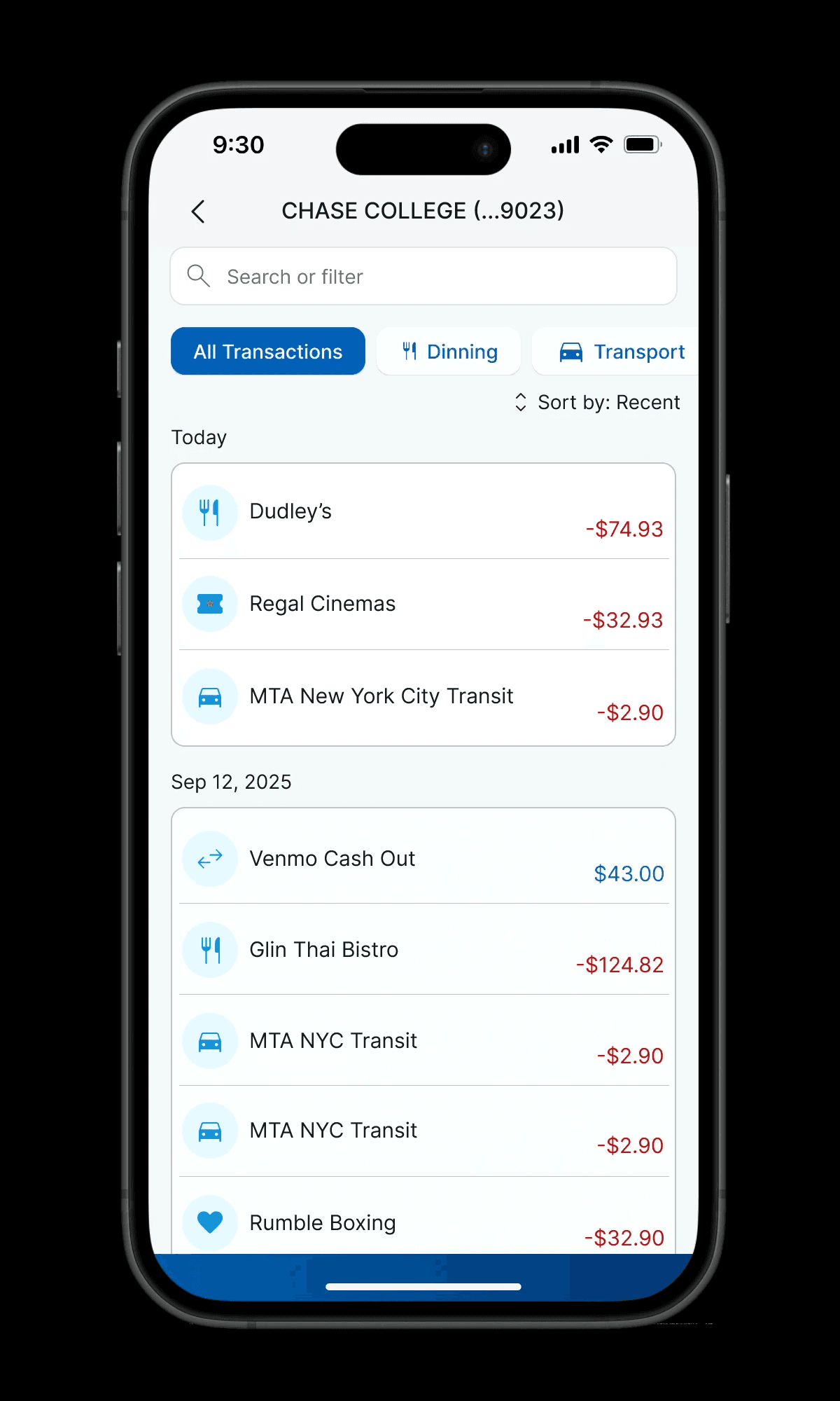
Adding icons to transactions helps users visually understand the type of transaction at a glance. This redesign creates a cleaner, less cluttered view while enabling easy filtering by category.
Adding icons to transactions helps users visually understand the type of transaction at a glance. This redesign creates a cleaner, less cluttered view while enabling easy filtering by category.
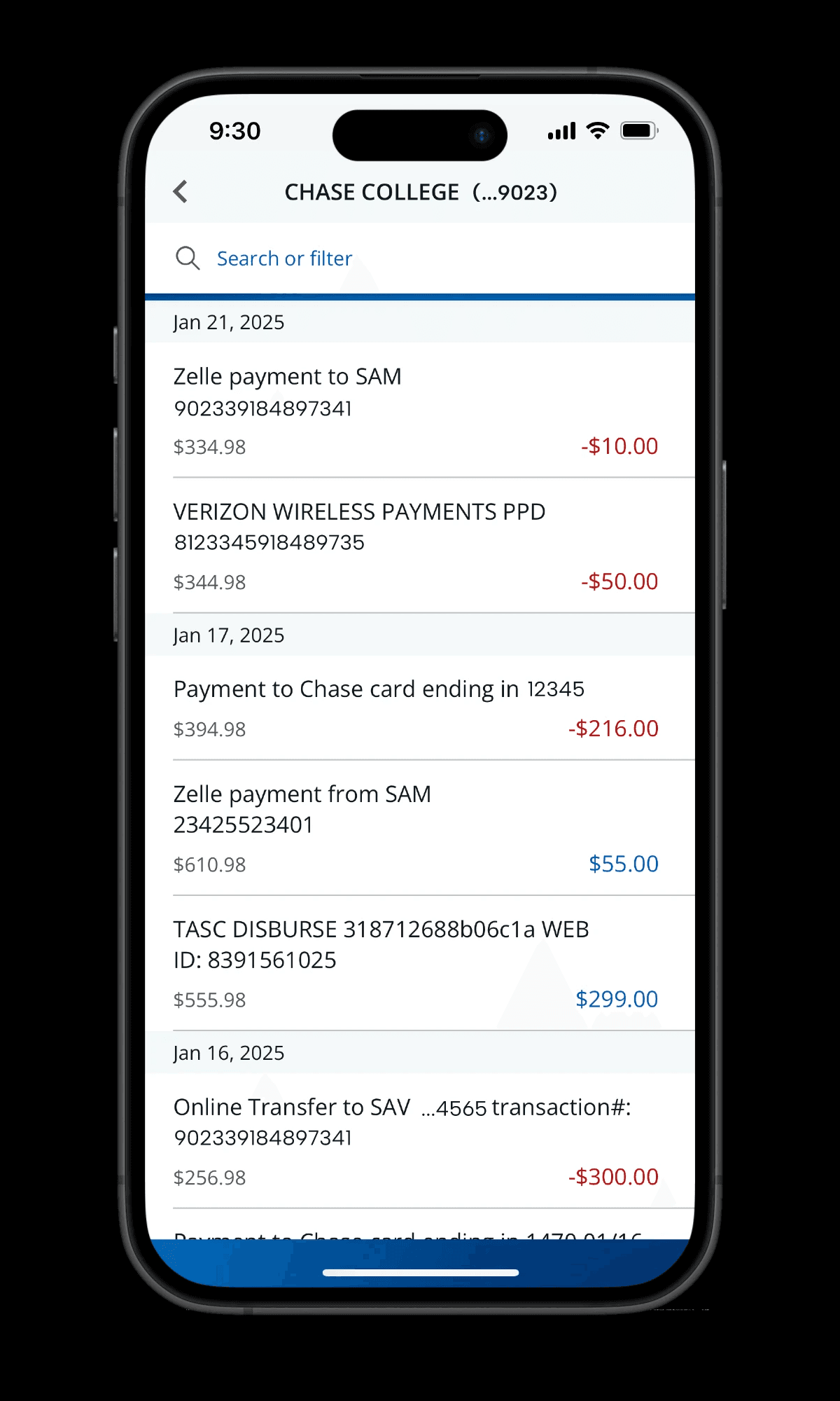
Before
After
After
Before
Key Solution 2: Smart Date Range Selection
Key Solution 2:
Smart Date Range Selection
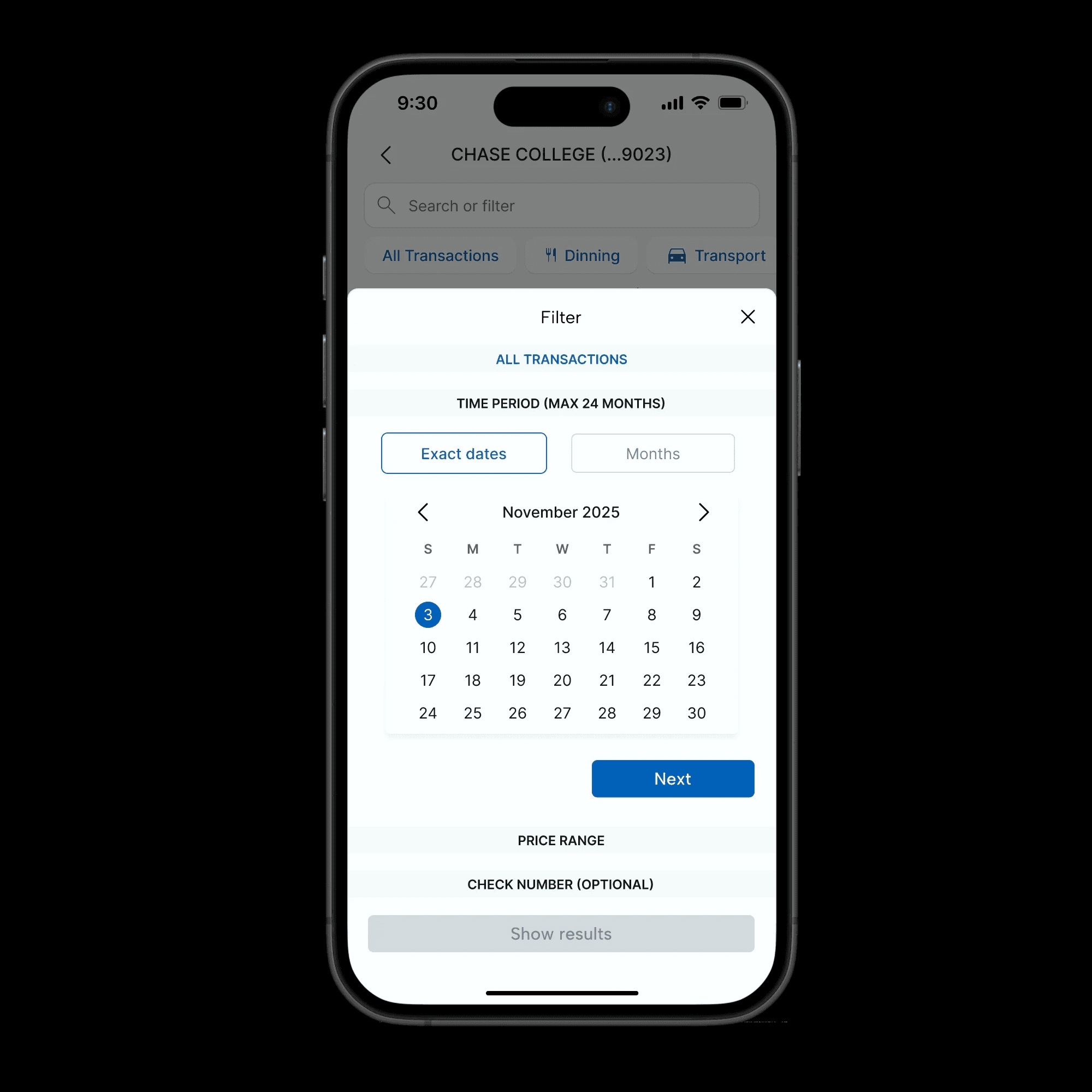
Implementing a date range picker enhances user efficiency by allowing the selection of multiple dates in one interaction. This feature enables users to quickly analyze transactions over specific periods, from days to months.
Implementing a date range picker enhances user efficiency by allowing the selection of multiple dates in one interaction. This feature enables users to quickly analyze transactions over specific periods, from days to months.
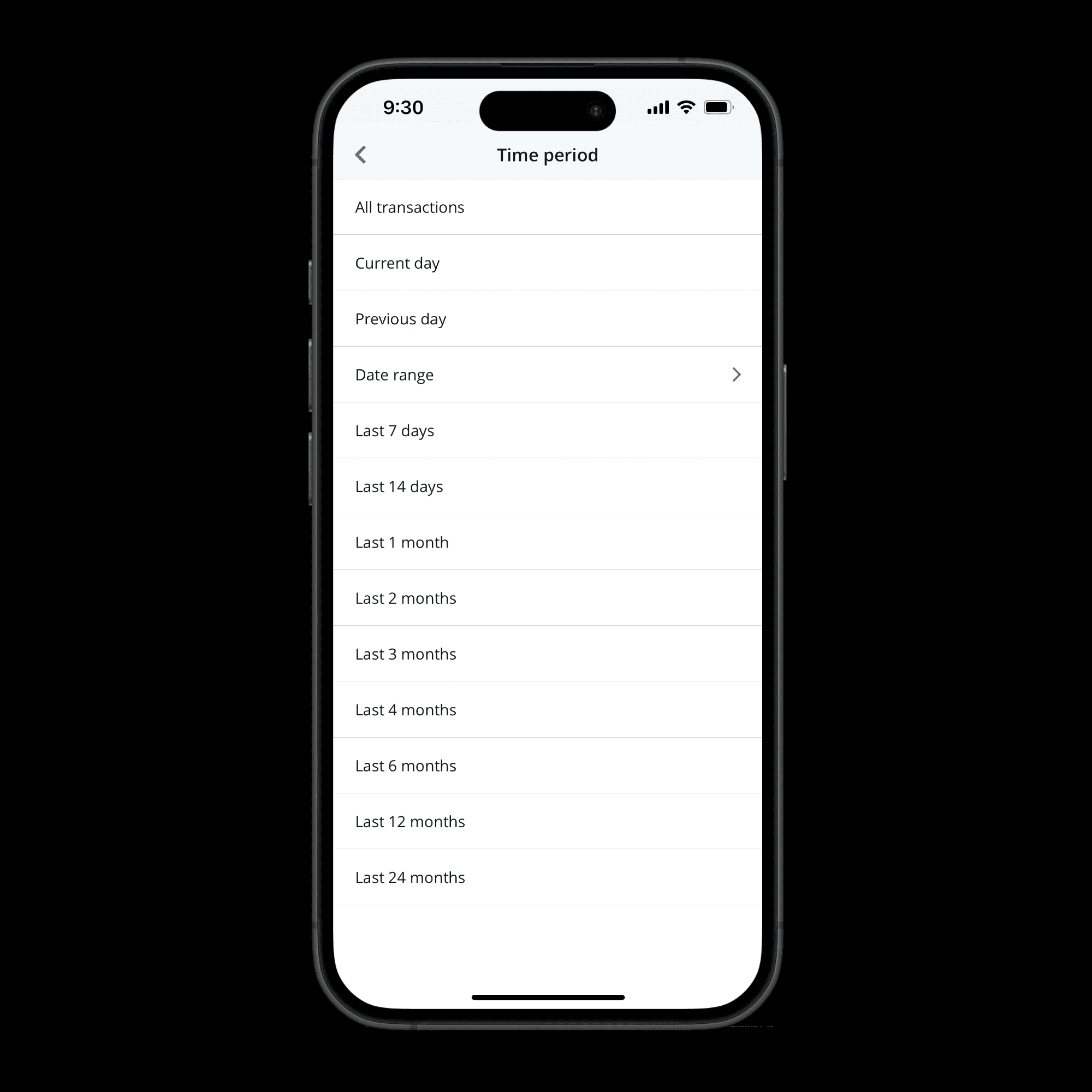


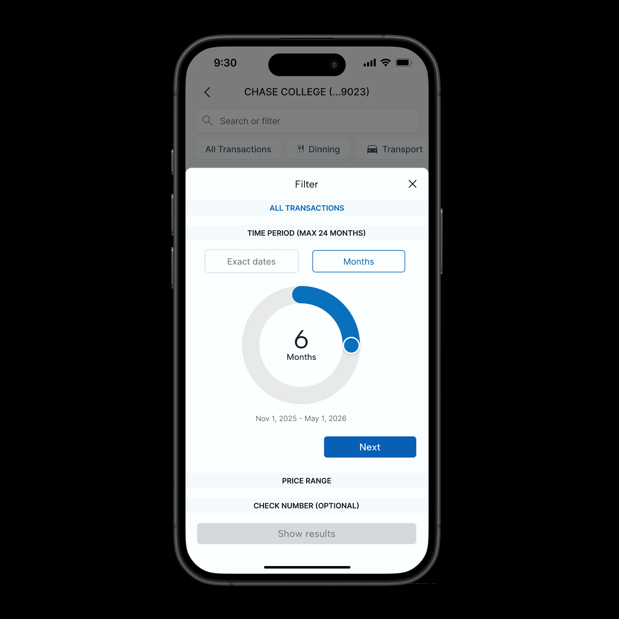
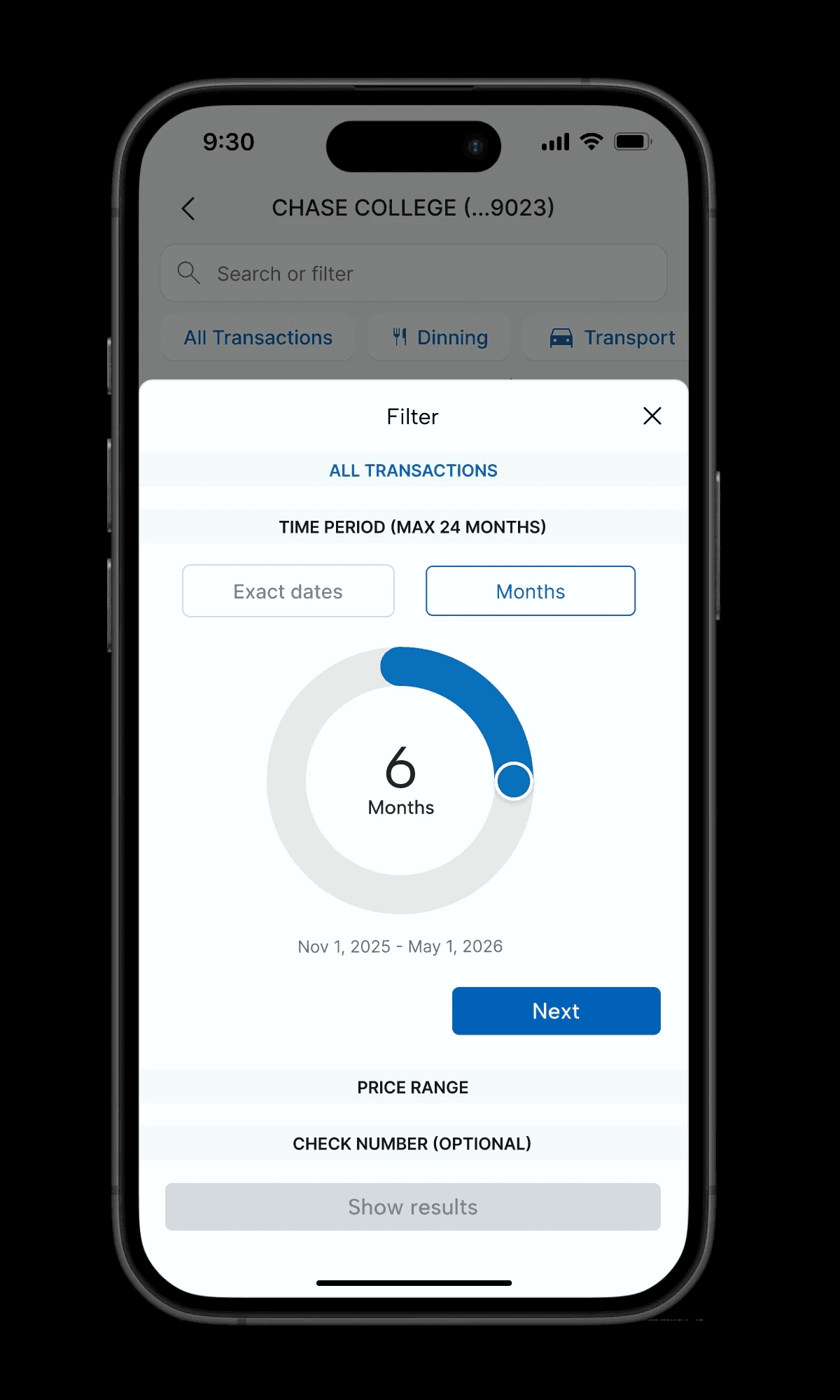
After: Simplified filter
Before: Complex Filter
Before: Complex Filter
After: Simplified filter
Design Decisions & Rationale
Design Decisions & Rationale
Cognitive Load Reduction
Icons allow users to process information visually before cognitively, reducing mental effort required to scan transactions.
Cognitive Load Reduction
Icons allow users to process information visually before cognitively, reducing mental effort required to scan transactions.
Mobile First Interaction
Redesign touch targets and simplified gestures optimize the experience for one-handed mobile use.
Mobile First Interaction
Redesign touch targets and simplified gestures optimize the experience for one-handed mobile use.
Interaction Efficiency
Smart presets address 80% of user needs with minimal interaction, following the 80/20 principle.
Interaction Efficiency
Smart presets address 80% of user needs with minimal interaction, following the 80/20 principle.
Results & Key Learnings
Results & Key Learnings
While exploring fintech design inspirations, I discovered that a purely modern approach risked alienating Chase's diverse customer base. The redesign prioritized a familiar design language that maintains the bank's trusted aesthetic while introducing subtle, user- friendly improvements.
While exploring fintech design inspirations, I discovered that a purely modern approach risked alienating Chase's diverse customer base. The redesign prioritized a familiar design language that maintains the bank's trusted aesthetic while introducing subtle, user- friendly improvements.